
The Identity of ANSUNG ENGINEERING
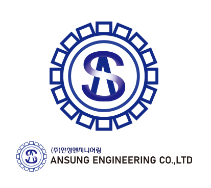
The logo of ANSUNG ENGINEERING embodies the founding philosophy and technical heritage of Ansung Machinery Co.,
established in 1983 as an industrial machinery manufacturer.
Far beyond a mere visual symbol, the logo represents the company’s origins and core identity.
Designed directly by the founder, the logo takes inspiration from a mechanical gear, symbolizing precision engineering, continuous innovation, and a commitment to sustainable growth.
This foundation in industrial machinery became the driving force behind the company’s evolution into a specialized manufacturer of ready-mixed concrete production facilities—bridging the worlds of mechanical technology and infrastructure construction.
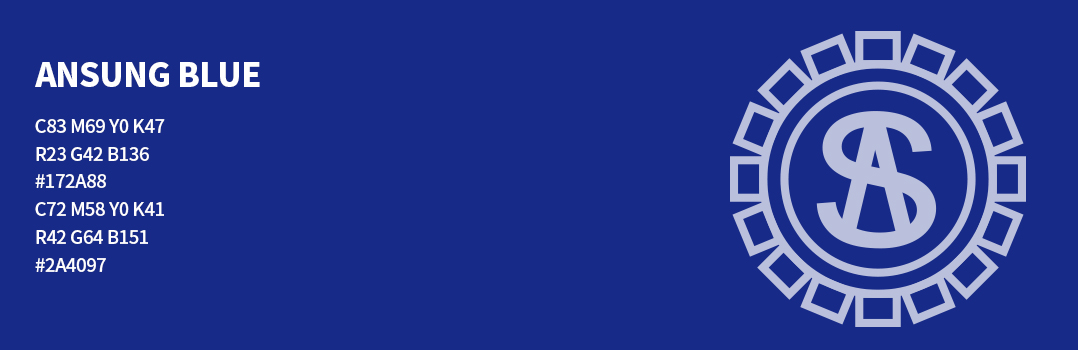
The deep navy blue reflects the vastness and permanence of the universe, while the circular form of the logo symbolizes organized structure, diligence, and cooperation—core values that represent the advancement of the construction machinery industry.
The transition from the original name “Ansung Machinery” to “ANSUNG ENGINEERING” reflects the company’s natural progression: from precision machinery to smart plant systems and advanced equipment.
This evolution embodies our vision—a company built on tradition and innovation, engineering and trust.
The Identity of ANSUNG ENGINEERING
The logo of ANSUNG ENGINEERING embodies the founding philosophy and technical heritage of Ansung Machinery Co.,
established in 1983 as an industrial machinery manufacturer.
Far beyond a mere visual symbol, the logo represents the company’s origins and core identity.
Designed directly by the founder, the logo takes inspiration from a mechanical gear, symbolizing precision engineering, continuous innovation, and a commitment to sustainable growth.
This foundation in industrial machinery became the driving force behind the company’s evolution into a specialized manufacturer of ready-mixed concrete production facilities—bridging the worlds of mechanical technology and infrastructure construction.
The deep navy blue reflects the vastness and permanence of the universe, while the circular form of the logo symbolizes organized structure, diligence, and cooperation—core values that represent the advancement of the construction machinery industry.
The transition from the original name “Ansung Machinery” to “ANSUNG ENGINEERING” reflects the company’s natural progression: from precision machinery to smart plant systems and advanced equipment.
This evolution embodies our vision—a company built on tradition and innovation, engineering and trust.
Primary Watermark Color Guidelines